Tutorial & FAQ Translations
မဲခေါင်ရေလှောင်တမံစောင့်ကြည့်နည်းကို အသုံးပြုပုံ (Burmese)
湄公河大坝监护平台教程和常见问题解答 (Chinese)
ការណែនាំអំពីឧបករណ៍តាមដានទំនប់ទន្លេមេគង្គនិងសំណួរដែលចោទសួរញឹកញាប់ (Khmer)
ບົດຮຽນກ່ຽວກັບ ລະບົບຕິດຕາມເຂື່ອນໄຟຟ້າຂອງແມ່ນໍ້າຂອງ ແລະ ຄໍາຖາມ-ຄໍາຕອບທີ່ພົບເຫັນເລື່ອຍໆ (Lao)
วิธีใช้ระบบติดตามเขื่อนแม่น้ำโขง (Thai)
Hướng dẫn sử dụng Công cụ Giám sát Đập thủy điện Mekong và các câu hỏi thường gặp (Vietnamese)
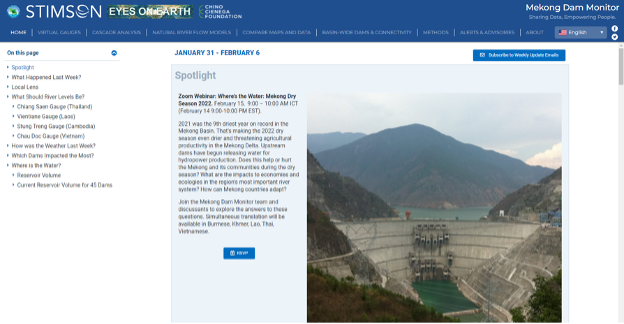
The Home tab (default landing page) provides a summary of how dams currently impact various parts of the Mekong mainstream and its tributaries. The remaining tabs go much deeper into the information provided on the Mekong Dam Monitor platform. Data on the platform is updated on a weekly basis and all data and maps are free for download. The tutorial below is organized by research questions. We hope you find it useful.
Q1: Can the Mekong Dam Monitor tell me how much water is currently missing or added into the river by operations of upstream dams?
Yes. After dams go into operation they have the ability to release or restrict water temporarily for a few hours, a few months, or even longer. Typically, in the Mekong, the largest dams release water during the dry season (December through May) to produce hydropower and restrict flow during the wet season (June through November) to store water. The MDM has three features that you can use to understand how much water is missing or added into the river: A) Home Page: River Levels, B) Natural River Flow Models, and C) Virtual Gauges.
Home Page: River Levels
- On the Home page, locate River Levels. This shows cross sections of the river at various MRC gauge sites along the course of the Mekong mainstream and summary statistics of missing water.
- Taking the Chiang Saen cross section as an example, we can see the blue shaded portion is the current river level. The dark blue line represents the expected height of the river if no dams were changing flow upstream. This blue line is calculated by Eyes on Earth’s Natural Flow Model.
- If the dark blue line is higher than the light blue shaded portion, then water is restricted or stored in upstream dams and is missing from the river.
- If there is extra water in the river, two shaded portions will appear: a dark blue portion representing the natural flow and a light blue portion above it showing the extra water being released from upstream dams.
- The black dotted line is the average river level for this month pre-2008. The baseline is 2008 because dams began to significantly change the flow of the river after that year.
- Not all cross-sections have dark blue lines showing natural flow. The dotted black line for average flow is also a useful indicator for the current impact of dams.
Natural Flow Model
- On the main selection menu, select the Natural River Flow Models tab.
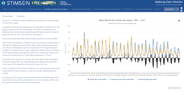
- The page opens to the Natural Flow Model for Chiang Saen, Thailand, but you can use the tabs to select natural flow models for other parts of the river.
- You’ll see a series of lines and shapes on the chart. To understand what’s currently happening, hover your mouse over June 2021. Holding the left button on your mouse, click and drag the mouse along the chart to September 2021. In this example, the interactive map transforms into a six-month time series that runs from April to September 2021:
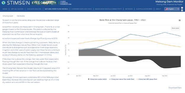
- The blue line in this chart represents the flow volume we would normally expect in a month given the observed surface wetness (precipitation, soil moisture, snowmelt, etc.) upstream of the gauge. For example, in September 2021 the expected flow volume value is 3,459 cubic meters per second (cumecs), which measures the volume and speed of river flow. In the chart we can see how the blue line rises from May through September. That is the natural wet season flood pulse of the Mekong at Chiang Saen. The orange line represents the actual flow volume measured by the Mekong River Commission (MRC) gauge at Chiang Saen. The actual September flow volume value was 1,916 cumecs.
Why is the orange actual value different from the blue natural flow value? Upstream dams, water diversions, or another man-made factor is causing the difference. In the wet season months (June to November), upstream dams typically restrict flow, and this is why the blue natural flow line suggests there should be more water in the river than what the orange actual flow line shows. In the dry season month of April, we would see the opposite: the orange actual flow line will be higher than the blue natural flow line, suggesting that upstream dams are releasing water and increasing the river flow higher than natural conditions.
Coming back to September 2021, we can see that the expected natural flow is 1,543 cumecs higher than the actual flow, displayed as a negative number in the surplus/deficit value when you hover over the chart. Why is it negative? Because the water is missing from the river. This answers the question of how much water is currently missing in the Mekong at Chiang Saen. If the surplus/deficit value is instead positive, then there is excess or extra water in the river.
The black and grey shapes provide insight into how much water is missing or added into the river during a wet or dry season. Black shapes represent missing water and grey shapes represent excess water. In the example above, the black and the grey shapes are nearly identical. Why? Because dams restrict water to recharge their reservoirs during the wet season (black shape) to replace the water released during the dry season (grey shape).
You can click “reset zoom” to look at the longer data timeline and compare 2021 to previous years. For example, in 2019, we see the grey and black shapes are much larger than in 2021. This shows that the dams both restricted and released a lot more water in 2019 than they did in 2021. Usually, the shapes are nearly equal because wet season restrictions tend to equal the previous dry season restrictions. But sometimes the black shapes (missing water) are larger than the grey shapes before them. Why is there a difference? There could be errors in the natural flow model, but we think the major differences, such as grey in 2012 and 2013 below, are from permanent restrictions as major dams fill. When a dam fills, some water is permanently held behind the dam’s wall in what is known as “dead storage”. That water is never released. We know that the Nuozhadu dam—by far the largest in the Mekong basin—was filled in 2012 and 2013.
What else can you do with the Natural Flow Model feature?
- Click the legend indicators (Chiang Saen surplus/deficit, Chiang Saen Natural Flow Model, and Chiang Saen MRC gauge) to toggle them on and off.
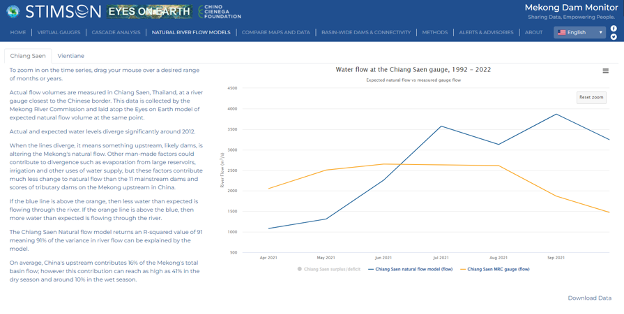
- Download the natural flow data in excel format for your own use by clicking “download data” in the bottom right corner
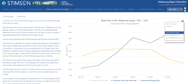
- Click the three-bar “hamburger” icon in the top right to download the image currently showing on the interactive chart in a variety of formats.
The Natural Flow Model is one of the most powerful features on the Mekong Dam Monitor because it tells us how much water should be in the river over any month between 1992 and the present at Chiang Saen, Thailand and Vientiane, Laos. The Chiang Saen Natural Flow Model feature shows us the impacts of China’s 11 dams and the Vientiane Natural Flow Model shows us the impacts of China’s 11 dams plus all dams in Laos between Chiang Saen and Vientiane.
Virtual Gauge Data
The Natural Flow Models tell us the collective impacts of upstream dams at a given point along the river. Our Virtual Gauges show the impacts of individual dams. What is a virtual gauge? A virtual gauge uses satellite data to track how reservoir sizes change over time, which then indicates how individual dams are releasing or restricting water.
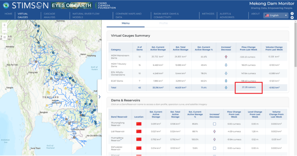
Summary data is available by dam category at the top of the Virtual Gauge Menu, where we can see the total status of active storage in the Mekong Basin and what percentage full the total status is. When the Est. Current Active Storage % number is high, then most seasonal storage dams throughout the basin are full. The Flow Change from Last Week summaries tell us how much flow dams are reducing or adding to the river over the last week. The “Totals” value suggests 27.20 cumecs of flow was removed from the entire basin last week by dams. The effects of this flow reduction will be experienced throughout most in the lower stretches of the river in Cambodia and Vietnam.
Let’s use the Virtual Gauges feature to look at how the Nuozhadu Dam is impacting the river.
On the main selection menu, select Virtual Gauges and scroll down the page to find the Nuozhadu Reservoir in the list of dams. Here we can see some important information about the current state of the Nuozhadu dam’s reservoir.
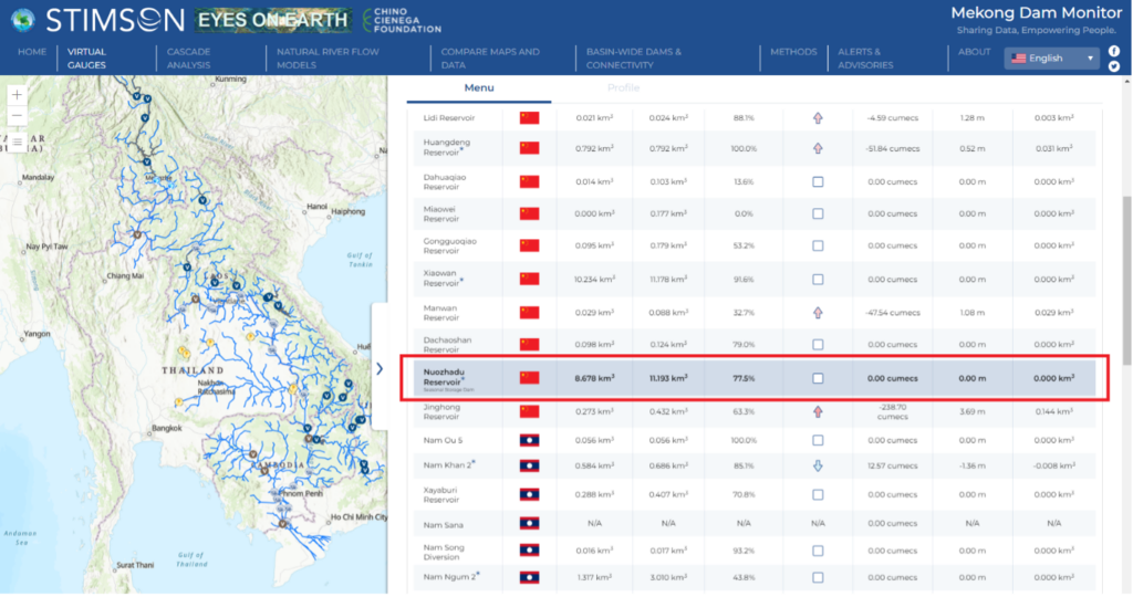
- Est. Total Active Storage is the total amount of water that the reservoir could hold to use for hydropower production. Think of it as a maximum possible amount. In this example the value is 11.193 cubic kilometers, or 11.193 billion cubic meters of water. This amount of water could be used to produce more than 2 billion kilograms of rice!
- Est. Current Active Storage is the amount of usable water we estimate is currently stored in the reservoir. This number changes from week to week as the dam releases or restricts water.
- Est. Current Active Storage % is simply the percentage of usable water in the reservoir compared to the maximum. In this example, the reservoir is 77.5% full.
- The Increase/Decrease column has arrows that tell us whether the reservoir filled or released water last week. If the arrow points up, then the reservoir is filling and restricting water. If the arrow points down, then the reservoir level is dropping as the dam releases water to produce hydropower. The redder the arrow, the more water is restricted and the blue the arrow, the more water is released.
- Level Change from Last Week tells us how many meters the reservoir increased or decreased. In the example, we see the Nuozhadu reservoir level did not change much this past week. Typically a seasonal storage dam like Nuozhadu will increase by one meter or less in one week. If the change is more than one meter, we know the dam is impacting the river more than usual.
- Flow Change From Last Week is the amount of flow the dam removed or added to the river. It’s displayed in cumecs (cubic meters per second), the same unit as displayed on the natural flow model. A negative number indicates the removal of water, and a positive number indicates the addition of water. In this example, Nuozhadu did not remove any water from the river. However, if you look to the next dam in the cascade you will see that there were restrictions at Jinghong.
- Volume change from Last Week is the total quantity of water added or released by the individual dam.
You can click on any dam/reservoir name to access a more detailed profile page for that dam/reservoir.
Q2: What else should I look at to understand the current state of the river?
Impact Areas
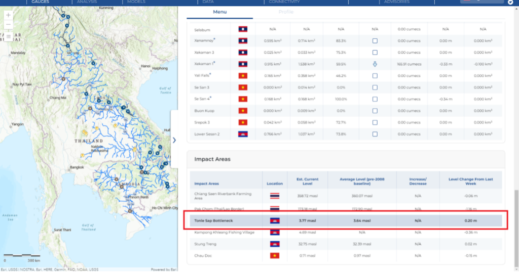
At the bottom of the Virtual Gauge tab is a list of Impact Areas. These are points along the river in each country that we think indicate the current health of the river. The Chiang Saen and Pak Chom impact areas are along the Thai/Lao border and therefore are somewhat representative of mainstream conditions in both countries.
We report the estimated river level in meters above sea level for all impact areas each week. One way to know whether the river level is higher or lower than normal is to compare the weekly estimate to the average level. For example, the Tonle Sap Bottleneck impact area provides an insight into the health of the Tonle Sap Lake. Last week the river level at the Tonle Sap Bottleneck was 3.77 meters, 0.34 meters lower than the average level. The average level is calculated across the years prior to 2008 when the impacts of dams began to really change the flow of the Mekong, so it’s a pretty good estimate of normal levels. The arrow tells us whether the river level went up or down last week and the level changed from last week.
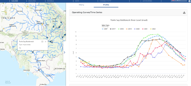
Clicking on the Tonle Sap Bottleneck virtual gauge takes you to its profile page. At the top of the profile we see an Operating Curves/Time Series chart with more information about the current health of the river. The 2022 line ends with the most recent river level estimate of 3.77 meters. Compare the 2021 line to the 2018 line, which looks like a sine wave. 2018 was a typical wet season for the Mekong, with the river rising quickly to high levels May through September and then gradually returning to dry season lows from October through December. This is what the Mekong River and the Tonle Sap have typically done for centuries and which supports the natural bounty of local fisheries. However, in 2021 the river rises later in the year and never gets close to the 2018 peak level before falling again. Similar patterns can be observed in 2020 and 2019. What’s causing the difference? We know 2019-2021 were drier than 2018, and drought will cause a lower peak, but dams are also driving some of that impact. The Mekong Dam Monitor can’t currently determine how much of an impact on the Tonle Sap is from dams.
Below the Time Series is Compare Images, which lets you compare satellite images. For details see the Q3: How do I look at satellite images of dams and reservoirs?
Wetness Anomaly Maps
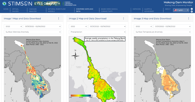
Another feature that helps us understand the current state of the river is the Wetness Anomaly Map which is located on the home tab and on the “Compare Maps and Data” tab.
These maps are available on a weekly basis and show us how wet or dry different parts of the basin are compared to a base period from 1992 to 2018. For example in the map below, the dark red pixels represent extreme dryness. The darker red the pixel, the more unusually dry the conditions are. The darkest red pixels indicate that the area is only so dry 5% (rarely) or less of the time across the 1992-2018 baseline. Conversely, the more blue or purple a pixel is, the more unusually wet that area is. For example, the areas showing as a purple pixel are only so wet 5% or less of the time across the 1992-2018 baseline.
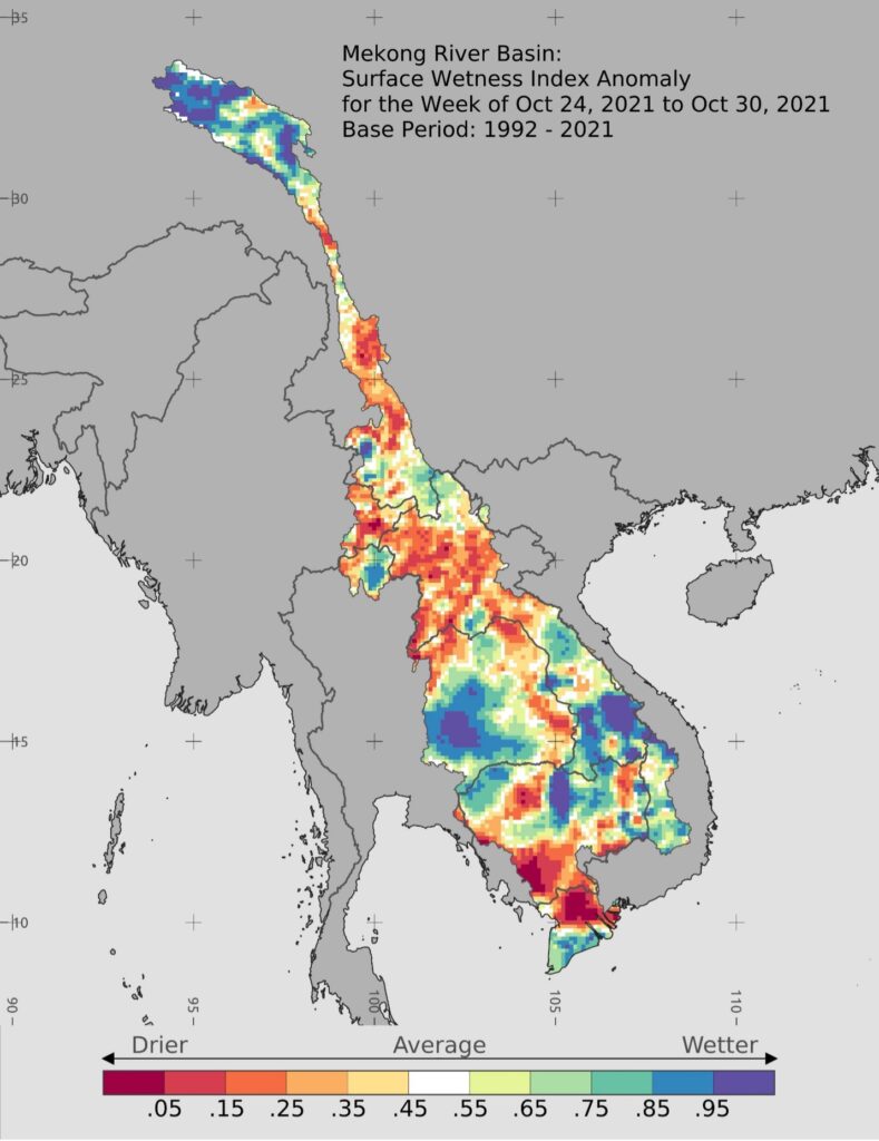
The map is useful because it shows us what parts of the basin are wetter and drier than normal. Normal conditions are marked by white pixels. Here is an interpretation of the map above.
There are extremely wet surface conditions in the headwaters of the Mekong basin. The gorge section in Yunnan was drier than normal, with near-average wetness above the golden triangle. Laos was dry in the north, near average in the center with localized extremely wet surfaces in the southern third of the country. The southern portion of Thailand was extremely wet, while there was a lot of spatial variability further north and east. The 3S Basin and eastern Cambodia had about average wetness, with a lot of spatial variability. The northwestern corner of Cambodia was moderately wet. The center of the country fluctuated between unusually dry and wet, including the area around Tonle Sap lake. The delta region of Cambodia and Vietnam is unusually dry
Q3: How do I look at satellite images of dams and reservoirs?
Individual Dams
- Go to the Virtual Gauges tab
- Select a dam that you’re interested in. For example, the Xiaowan Dam in China.
- Scroll down to the Compare Images section of the profile, which shows the latest satellite radar image of a portion of the reservoir. Satellite radar images see water and land through clouds and depict water as black and land as gray.
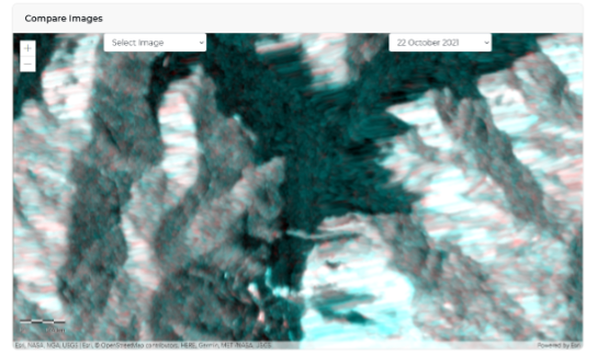
- The image above shows the Xiaowan reservoir in October 2021 nearly full.
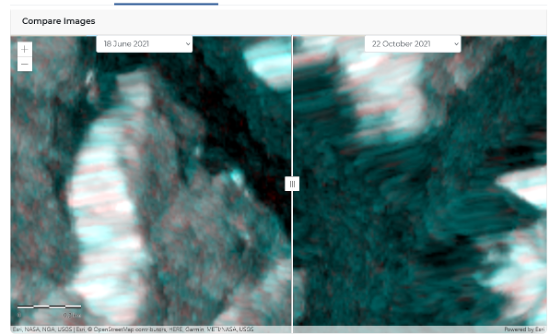
- Compare that to the reservoir’s lowest point for 2021 (identified via the time series above) by selecting June 18, 2021 in the left pull down menu. You can compare the images by dragging the slider across. See how much more black (water) area is in the September 16, 2021 image compared to the June 18, 2021 image? The reservoir filled up during this period and restricted an equivalent amount of water from the downstream.
Satellite basemap
- For a high-resolution color satellite image of the basin and most dams in the region, go to the Basin-Wide Dams and Connectivity tab.
- The dots show the locations of all dams in the Mekong Basin across four statuses: operational, under construction, planned, and cancelled.
- Clicking on a dot will zoom in on the dam. You can also search for a specific dam by clicking on the filter menu and typing the dam’s name in the search bar.
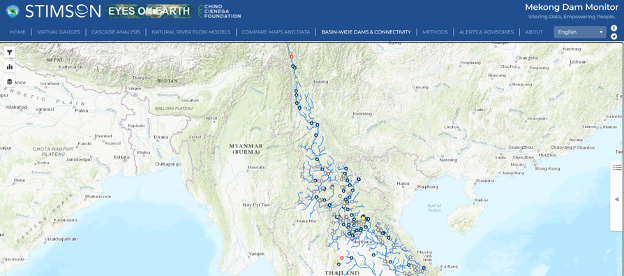
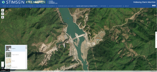
- This focuses on the dam’s location shown on a default topography basemap. To change to a satellite image, click on the basemap icon at the bottom left corner of the screen and select “Imagery”. The basemap transforms to a satellite image. If the dam/reservoir is not viewable then the dam is planned, under construction, or entered operation after the basemap was created.
- Here’s an example of the Xayaburi, Dam in Laos
Q4: How do I understand the impacts of China’s mainstream dams?
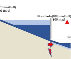
This was discussed above, but another way to understand the impacts of China’s mainstream dams is to review Cascade Analysis. This tab defaults to an image visualizing the status of water across China’s 11 mainstream dams on the Mekong mainstream, which is the first cascade we have analyzed. The current reservoir level is displayed for each dam in comparison to its maximum normal reservoir level. An arrow beside the current reservoir level shows the direction of reservoir change compared to last week. In this example, the Nuozhadu reservoir is at 800 meters above sea level (masl), close to its normal maximum level of 810 masl. The light blue area is the volume of active storage in the reservoir (what’s active storage?) and will go up and down throughout the year as the dam operates.
The colors red (minimum), yellow (slow), blue (normal), green (fast) represent the rate of water flow (arrow) and electricity production (lightning bolt). In the example, a red arrow indicates that there is reduced flow compared to the previous week, and a red lightning bolt indicates reduced hydropower production.
You can select any week of the year from 2016 to the present and also use the arrow buttons in the top right corner to cycle through the weeks to watch the reservoir conditions change week to week.
Q5: What is an operating curve?
The Mekong Dam Monitor helps us understand how dams are operated over a long period of time. This is useful because many dam operators do not provide such information in publicly accessible ways. Observing how dams have previously operated can sometimes predict how they will be operated in the future. We can use this data to determine whether the dam is a seasonal storage dam, run-of-river dam, or hydropeaking dam by looking at how the dam is operated. This is done by observing the dam’s operating curve.
- Select the Virtual Gauges tab and select the reservoir Xiaowan Dam under the Mainstream Damssection.
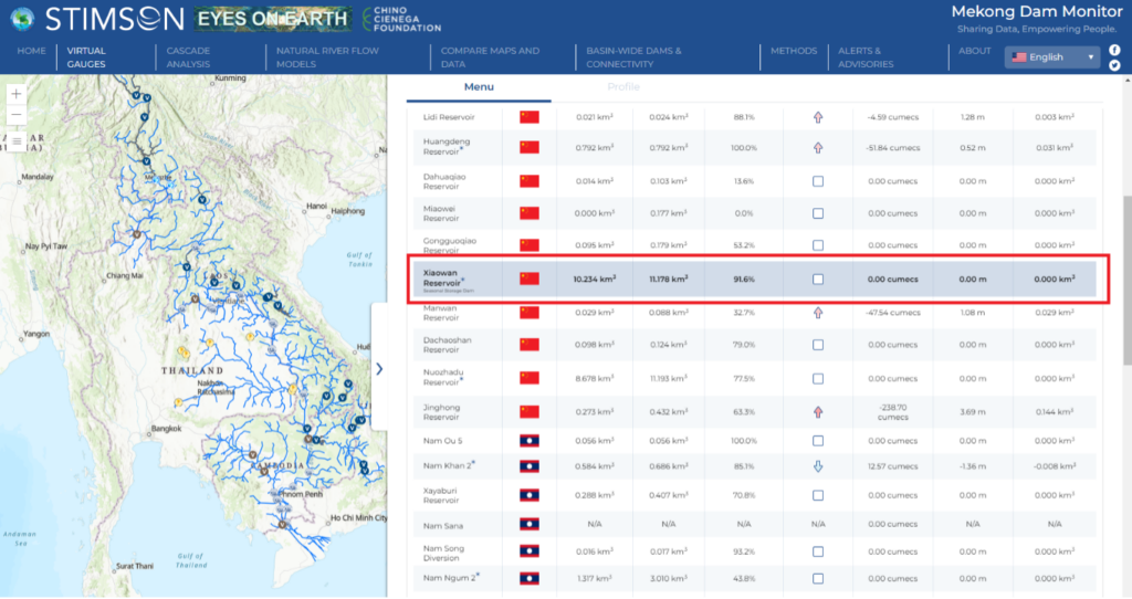
- Let’s take a look at how the dam is operated in 2019, so select 2016, 2017, 2018, 2020, and 2021 to remove them from the chart.
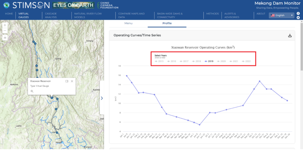
- The updated chart shows the Xiaowan dam reservoir level starting at a high point in January 2019 and gradually descending through June of 2019. When the line goes down, that means the dam is releasing water. 2019 is a good year to observe because we estimate the year started at the reservoir’s highest possible point in January and then released all of its usable water (active storage) to the reservoir’s lowest possible point in June of 2019. This was the result of releasing water to produce hydropower during the dry season (learn more about this here). When the wet season begins in June 2019, we see the line rise gradually to a high point in October as the reservoir fills. Note in the late months of 2019, the reservoir did not fill as high as in January 2019 before it began to produce hydropower.
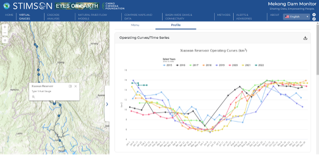
- Click all the years (2015, 2016, 2017, 2018, 2020, 2021, and 2022) to display the operating curves for all years in the dataset. You can see that the Xiaowan Dam follows fairly predictable patterns of releasing all of its usable water (active storage) during the dry season and recharging its reservoir in the wet season. These are the patterns of a seasonal storage dam, which has the greatest effect on reducing natural flow during the wet season and increasing flow during the dry season. These impacts rise for dams with large reservoirs such as Xiaowan and Nuozhadu.
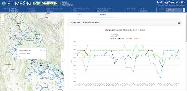
- Looking at operating curves can also identify whether the dam is a hydropeaking dam. For example, select the Jinghong Dam on the Virtual Gauge list. Looking at the Jinghong Dam’s Operating Curve/Time Series chart, you see it is unlike the seasonal storage dams above and follows no predictable pattern. The line goes up and down frequently and somewhat randomly. This is because the Jinghong Dam is a hydropeaking dam, which frequently releases water and restricts flow to produce hydropower typically during the daytime and then restricts often the same amount of water overnight or across a short period before repeating the pattern again. This kind of operation is an optimal way to meet electricity demand since people tend to consume more electricity during the day than during the night. However, this kind of operation shocks the river downstream of the dam for hundreds of kilometers by suddenly raising or lowering the river level. Repeated shocks like this are proven to reduce fish populations and severely impact wetlands and forests along the river’s course. Another kind of dam that can be determined by looking at a dam’s operating curve is a run-of-river dam. Go back to the Virtual Gauges tab and look at the Xayaburi Dam. This operating curve is mostly determined by the natural flow patterns of the river; whatever flow comes into the Xayaburi Dam’s reservoir will quickly flow out of the dam’s outlet in a matter of days. Xayaburi does not store water for long periods of time like seasonal storage dams and it does not operate like a hydropeaking dam with no predictable pattern. In addition to Xayaburi, the Don Sahong and Lower Sesan II dams are operated as run-of-river dams. These run-of-river dams have less impact on the natural flow pattern of a river, but they do have severe impacts on fish migration and sediment flow.
Q6: Where do I go on the Mekong Dam Monitor to find out the year a particular dam was completed or other information about a dam such as whether it has fish ladders?
To answer these questions about any of the dams listed on the Virtual Gauges tab, click on the dam you are interested in and scroll down to the list of factual information about that dam.
To answer these questions about other dams not listed on the Virtual Gauges Tab, click the Basin-Wide Dams and Connectivity tab. Here you can find information about all the dams in the Mekong. The map shows icons of different colors for more than 400 hydropower dams in the Mekong. Dark blue icons are completed dams, yellow icons are dams currently under construction, grey icons are planned dams, and red icons are cancelled dams.
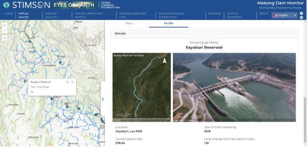
You can navigate around the map to look at projects. Clicking on an individual icon will bring up factual information on that dam, including the year completed. You can also use the filters to search for a specific dam by typing the project name into the search box or running searches based on specific project criteria, such as by project status or year of completion. You may be able to find details on fish ladders or mitigation infrastructure by clicking on hyperlinks listed in the “Link” or “Updates” indicators.
Q7: How can I help improve the Mekong Dam Monitor?
- Send us your photos of livelihoods, culture, and environmental impacts along the course of the river and its tributaries. Click the Share your photos button on the front page to send us your photos. We publish most photos we receive for one month and the best photos are chosen as a photo of the week. Your photos help point to emerging issues and give us ideas on how we can provide new information on what’s happening in the Mekong. Share your photos.
- Give us your feedback any time by emailing questions, comments, or thoughts you have about the Mekong Dam Monitor to Brian Eyler at [email protected].
Q8: What data is available for download and how do I download it?
All data provided on the Mekong Dam Monitor is available for download. Look for download buttons on the various displays throughout the online platform. You can also right-click and save any images or maps on the Mekong Dam Monitor for your personal or professional use. We ask that you give us credit by telling your friends that you got this information from the Mekong Dam Monitor. Also, if you publish the information in a report or for a presentation, please cite us as “Stimson Center and Eyes on Earth Mekong Dam Monitor, [your date of access], https://www.stimson.org/project/mekong-dam-monitor/.”

