The Suitability Mapper is a mapping tool that allows users to identify suitable areas for infrastructure development based on customized queries. For example, a planner might be interested in developing a solar project in an area but also avoiding building the solar project in an area of high biodiversity. The Mapper’s data are derived from publicly available online sources and have been cleaned and transformed to meet the needs of the suitability widget. Through this tool, the Stimson Center hopes to improve access to GIS research and data transparency, provide analytical components to further strengthen ESG standards, and mitigate future project risks.
Video Tutorial
Walkthrough
This document will provide a detailed walkthrough on how to use the Suitability Mapper including the dashboard widget functions and the suitability modelers. For additional information or questions, users may visit the FAQ page or contact the Mekong Infrastructure Tracker’s support team at [email protected].
Front page functionalities
Click to zoom.
Users access the Mekong Infrastructure Tracker Suitability Mapper and other interactive tools from the Mekong Infrastructure Tracker Project page. Clicking on the tool will launch the Suitability Mapper as shown above. The default view is focused on the Greater Mekong Subregion and all regional projects across the Tracker’s infrastructure geodatabase. Users may interact with the tool by moving the map (left-clicking the map and dragging), zooming in and out (scrolling the mouse wheel or double left-clicking the map), and displaying pop-up tooltips for additional information (clicking projects).
Click to zoom
Clicking on a project leads to a pop-up that displays all projects in the near vicinity. Aside from the project details, there are four areas of interest to the user. The top-left corner will display the number of projects included in the pop-up. The top-right corner allows users to flip through multiple projects (next and previous), maximize the project detail pop-up, and exit the pop-up. In the bottom-right, users may pan to the project or place a marker as a bookmark. Finally, the bottom-left allows users to zoom in further to the project.
Click to zoom
The tool’s widgets are divided into two sections. The first section contains the suitability modelers which allows users to create different project suitability models using embedded data layers. The second section contains basic map functions like the zoom slider, return to home view, a drop-down layer legend, an interactive list of data layers, and infrastructure projects filter.
Suitability Modelers
The suitability modelers are the main analytical tools in the Suitability Mapper. There are multiple models for users to choose from including a general model which includes all the data layers available and specialized models that contain subsets of layers found in the general model. There are three general steps to use the modelers: selecting layers, designing the model, and optionally creating a chart.
Select a suitability model. Click to zoom.
Users begin by selecting data layers of interest. Users may select up to fifteen layers per model. Aside from the data layer titles, additional data information and a preview of the layer may be toggled by selecting the information tooltip and globe icon, respectively. Finally, the model’s suitability product layer’s transparency may be adjusted using the slider tool.
Assign importance of each layer, adding up to 100%. Click to zoom.
Build the model to fit data preferences and values allocation. The second step requires users to adjust values and preferences to meet research needs. Users need to assign layer importance and adjust pixel values for each layer. Importance of layers are assigned in the fill-in boxes and are measured by percentage. A model’s layers’ importance must total 100% in order to properly work and are set at the discretion of the user.
Assign values to the layer’s categories. Click to zoom.
Next, the user must set the pixel values for each layer. This can be done by clicking on each layer’s setting icon and adjusting the values of each category within the layer between zero and nine. In addition to setting a layer’s influence in the model, setting categorical values per layer will also equally affect the model’s final layer with higher values being more desired than lower values. For example, a category with a value of six is more valued than a category valued at five or below. Finally, the user can set different legends and color scheme to display the model’s data layer. Once the model’s design is finalized, the user can run the model. The more layers in the model, the longer it will take to create the final data layer.
Run the model and open the legends to understand map values. Click to zoom.
The model will create a map layer that can be used to find areas that are more suitable for projects based on the model’s layers. The higher valued colors on the map will represent which regions are best suited for projects. High valued colors vary depending on which color scheme was chosen by the user while designing the model. Users may also toggle on the legend widget to find color values for the model’s map.
Draw a feature or use existing layers to summarize the area. Click to zoom.
Users may optionally generate charts for areas of interest drawn using the modeler’s chart function. Users draw a polygon or select features from the Tracker’s infrastructure geodatabase to generate a chart. Multiple polygons and features may be used to create a summarized chart that displays an area’s value of suitability and its categorical distribution. Clearing polygons ore features will reset the chart.
Map functions
Map functions in the suitability mapper. Click to zoom.
Left side controls affect the map extent and filters for adjustable layers of data. The first widget is the zoom slider; users can zoom in and out with this tool. The second widget is the home function which brings the user back to the default map view. The third widget displays layers on the map and allow users to toggle layer visualization. The fourth widget is the legend for active layers, including final model products. The fifth widget is the filter tool that allows users to filter a set of layers for both viewing purposes and filtered reports. Finally, the fifth widget is a searching tool you can use to pan to specific geographic locations for further screening.
Filter
Click to zoom.
This widget allows users to filter out data points by specific attributes. Filtering will affect two aspects of the user’s experience: the map will only display data points that match the filter and reports will only include filtered data points for the specific filterable layers. In the current set-up, the Mekong Infrastructure Tracker databases are included as preset filters, but users may filter additional layers and attributes with custom filters. Filters only work when they are toggled on, in the image the linear infrastructure layer is activated while the energy infrastructure layer is not. Custom filters are available for users through the bottom right button.
How-to example
In this example, we will run the renewable energy suitability modeler to look for areas of high suitability based on our layers of interest. As project developers, you might be interested in identifying areas suitable for solar development with minimized environmental and social impact.”. You can use the renewable energy suitability modeler to create a map layer to assist policymakers in supporting the identification of these regions. To start, you select the Renewable Energy Suitability Modeler and select layers.
Select relevant layers. Click to zoom.
First, select the layers of interest in the renewable energy suitability modeler. In this example, four layers are selected: solar PV power potential, species richness and rarity, population density, and land cover.
Click on globe icon to add data layer to map. Click to zoom.
You can click on the globe icon next to each layer in the model to preview the layers and examine the data format.
Explore data pages for more information. Click to zoom.
You can also click on the information tooltip icon which redirects you to the data page with a summary of the data layer.
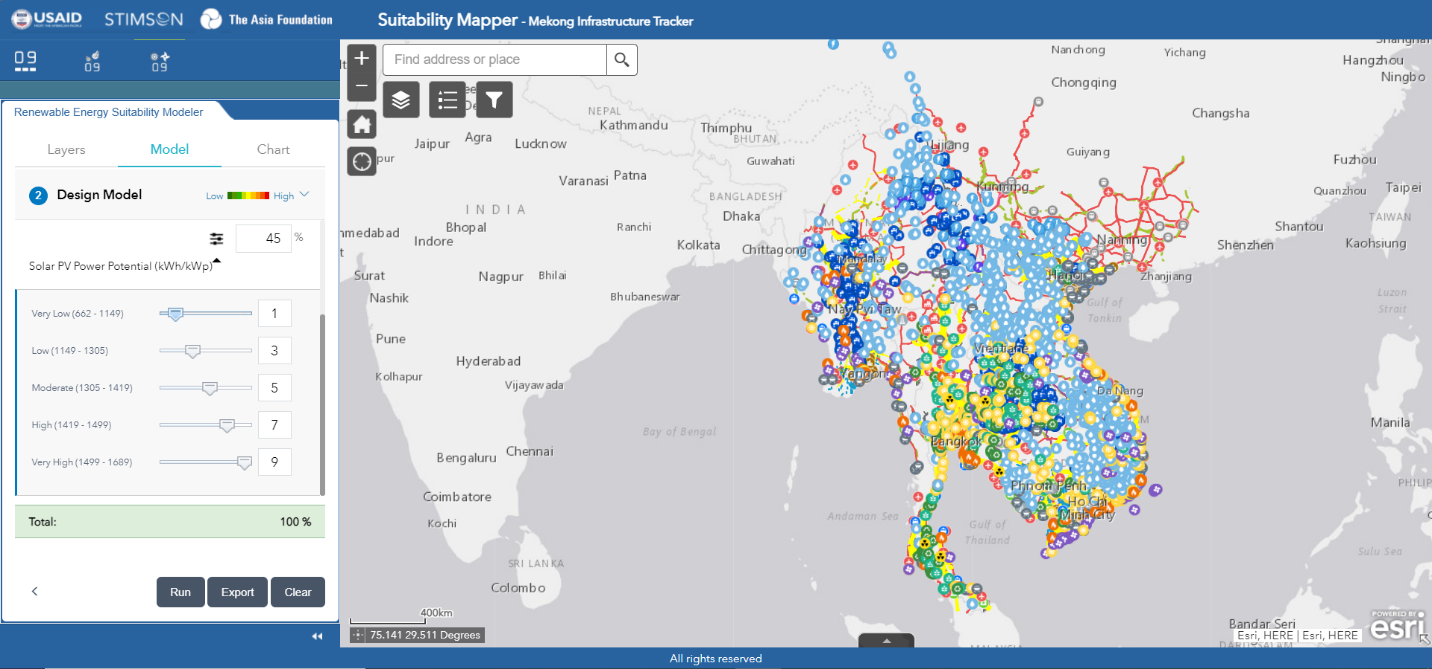
Set model parameters. Click to zoom.
Next, you design the model by assigning layer influence and setting categorical values across the layers. The total amount of influence must equal 100% and as a project developer you may value solar PV power potential the most and avoiding, in order of importance, areas of high species richness and rarity, certain land cover types, and densely populated areas.
Adjust categorical values. Click to zoom.
Now categories in each layer need to be set. For example, under the solar PV power potential data, you may value very high power potential over very low, so you would set the higher PV output with the highest value of 9 and incrementally go down until the lowest PV output value is set to 1. You repeat the process the other layers included in the model until all categories have a value placement. Finally, before running the model, you can set the color scheme of the model’s output.
Run the model to generate a suitability map layer. Click to zoom.
The processing time for a model varies depending on how many layers you included and how detailed the layers are. You will notice a loading figure at the bottom right corner of the tool as the model is processing. Once processing has finished, the new model layer will be added onto the map. As with any other layer in the tool, you can interact with this new layer in the Layers List and Legend widgets under the map functions.
Draw a polygon to generate a chart. Click to zoom.
Additionally, you can create charts to present summaries of certain regions or layers. For example, you can draw a polygon northeast of the Tonle Sap in Cambodia and create a chart that shows how suitable this region of the Greater Mekong Subregion is for solar power development.
You may now use the model layer, the chart, and the Mekong Infrastructure Tracker’s geodatabase to supplement your own research in finding suitable locations for projects and mitigate environmental and social risks.
Home to more than 100 scholars and global affiliates, the Stimson Center is proud to be a magnet for the world’s leading experts on the most pressing foreign policy and national security issues of our time. Explore our experts and their work.


Community Adaptation for a Water Festival Without Clean Water