Introduction
The Project Impact Screener is a screening tool based on the underlying geodatabase from the Mekong Infrastructure Tracker. It is supplemented by a collection of regional socio-economic, political, and environmental geospatial data layers users may use to track the possible impacts of infrastructure development in the Greater Mekong Subregion. All additional data layers have been cleaned and analyzed to fit the needs of the Screener, and data source and additional information is provided in each layer. By publicly providing this information, the Stimson Center hopes to cultivate a need for data transparency, regional cooperation, and an active user community that will contribute to the database’s growth.
Walkthrough
This document will provide a detailed walkthrough on how to use the Project Impact Screener including the use of dashboard widgets, and the screening and exporting of filtered data. For additional information or questions, users may visit the FAQ page or contact the Mekong Infrastructure Tracker’s support team at [email protected].
Front page functionalities
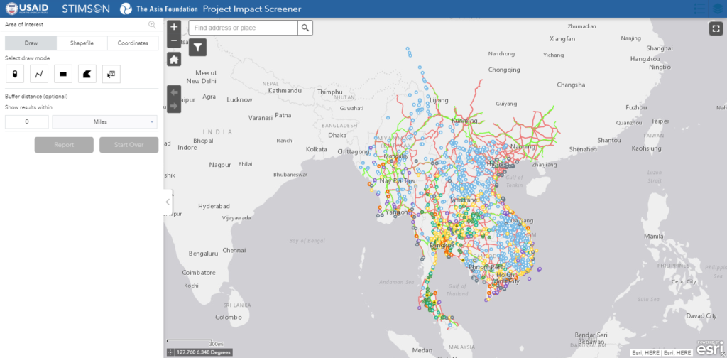
Users access the dashboard, screener, and other interactive tools from the Mekong Infrastructure Project page. Clicking on the tool will launch the Project Impact Screener as shown above. The default view is a zoomed-out projection of regional energy and linear infrastructure projects from Stimson Center’s Mekong Infrastructure Tracker database. From here, users may interact with the tool by moving the map (left-click the map and drag), zoom in/out (scrolling the mouse wheel or double left-clicking the map), and clicking projects for additional details.
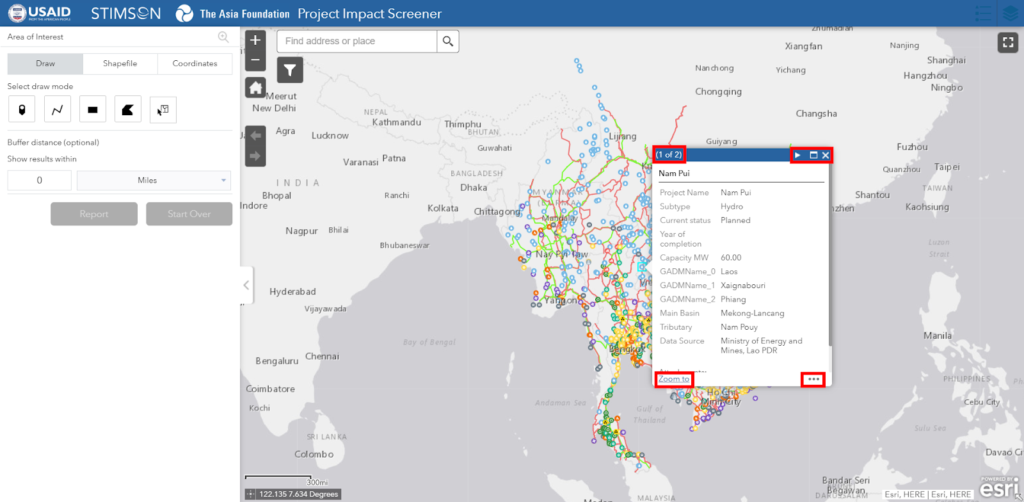
Clicking on a project leads to a pop-up that displays all projects in the near vicinity. At smaller map scales, multiple projects may be included in the pop-up, but as users zoom in to a larger scale, only specified projects will be included. Aside from the project details, there are four areas of interest to the user. The top-left corner will display the number of projects included in the pop-up. The top-right corner allows users to flip through multiple projects (next and previous), maximize the project detail pop-up, and exit the pop-up. In the bottom-right, users may pan to the project or place a marker as a bookmark. Finally, the bottom-left allows users to zoom in further to the project.
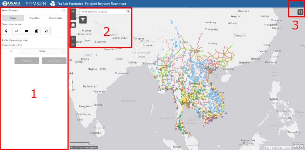
The tool’s widgets are divided into three sections. The first section contains the screening tool which allows users to use multiple methods to gather data points in an area of interest. The second section contains map functions like the zoom slider, return to home view, extent navigation, data filter, and a geographic search bar. The third section includes a drop-down legend for layers actively displayed, an interactive layers list, and the full screen toggle.
Screening tool
The screening tool is the main function of analysis in the Project Impact Screener. After creating an area of interest in the map, users may create a report of all features within and export it in a CSV format for further analysis. Data exported from this tool only include active layers and each layer will be downloaded as a separate file. There are currently three methods of creating areas of interest, they will be discussed further below.
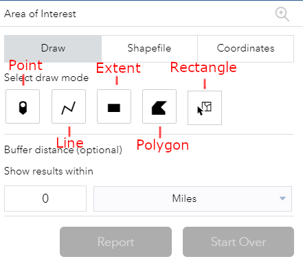
The draw feature allows users to draw several different types of shapes onto the map. Point mode allows users to drop a point anywhere on the map. Users may drop a point on a particular project for specific data overlaps, but this tool is most efficient with a buffer. This optional step creates a circular buffer around the point of interest at the user-designated distance. Line mode draws a straight line between two points and may be continued for as long as the user desires. Extent mode draws a rectangle. Polygon mode draws a shape dictated by the user that can encompass any form. Finally, rectangle mode selects features from a particular layer and can be adjusted under “Choose selectable layers”. Users are recommended to limit selectable layers to no more than three to avoid processing errors or crashing the tool.
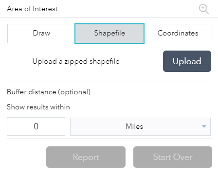
Shapefile mode allows users to upload a zipped shapefile from which users can create and download a report. Issues have been experienced with large detailed shapefiles like certain countries or large regions, it is advisable to limit shapefiles to subnational regions.
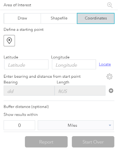
Coordinates mode allows users to choose a specific point to generate a report. Like the point mode, users are advised to use this mode with a buffer for better results.
Map functions
The next two sections are map functions that users may use to navigate around the map and adjust the visibility of overlapping data layers.
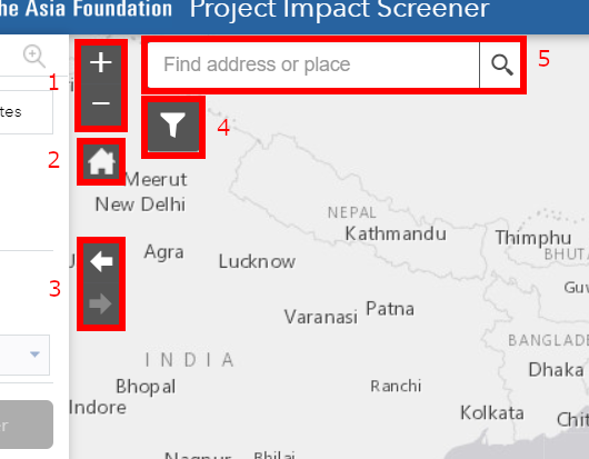
Left side controls affect the map extent and filters for adjustable layers of data. The first widget is the zoom slider; users can zoom in and out with this tool. The second widget is the home function which brings the user back to the default map view. The third widget is the extent navigator and allows users to move between current and past map views the user had before. The fourth widget is the filter tool that allows users to filter a set of layers for both viewing purposes and filtered reports. An in-depth explanation of the filter tool is provided later in this walk-through. Finally, the fifth widget is a searching tool you can use to pan to specific geographic locations for further screening.
Right side controls include toggling data layers, viewing the legend for active layers, and controlling the tool’s window view. In the first section, users can open a map legend pop-up for layers displayed on the map. The legend pop-up interacts with the layers displayed which can be toggled in the widget next to the legends. Finally, the last widget allows users to maximize the Project Impact Screener to a full window.
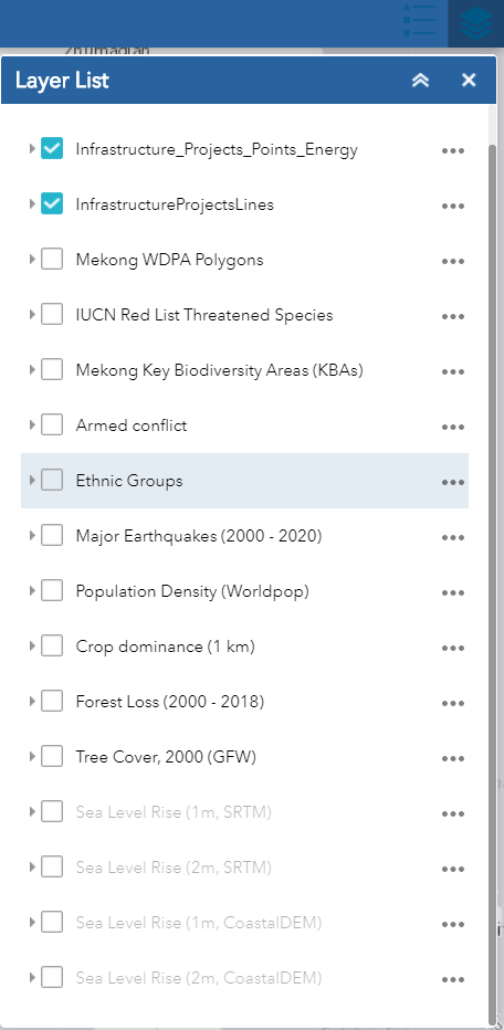
The image above shows the layer list that is currently available to users. The energy and linear infrastructure projects layers are, by default, toggled on and additional layers may be turned on by the user. Layers that are grayed out represent layers that cannot be viewed in the map’s current scale, but they will be viewable once the user zooms in closer. Of the layers initially included, eight are features users may interact with. The other layers are rasters, which provide region-wide data at predetermined pixel sizes. At the time of launch, the tool’s underlying ESRI web service, ArcGIS Online, has not incorporated raster analysis into its applications but plans to update this functionality are already in place once ArcGIS Online has updated its raster services. For now, users may overlay the raster layers as visualizations like basemaps.
Filter
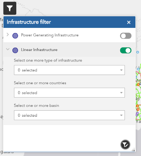
This widget allows users to filter out data points by specific attributes. Filtering will affect two aspects of the user’s experience: the map will only display data points that match the filter and reports will only include filtered data points for the specific filterable layers. In the current set-up, the Mekong Infrastructure Tracker databases are included as preset filters, but users may filter additional layers and attributes with custom filters. In the image on the left, the energy infrastructure layer is collapsed, and the linear infrastructure is opened, users can collapse and open layers with the arrow to the left of the layer. Filters only work when they are toggled on, in the image the linear infrastructure layer is activated while the energy infrastructure layer is not. Custom filters are available for users through the bottom right button.
Example
In this example, we will run the screening tool on the area surrounding Vientiane, Laos. We may be interested in seeing how many energy and linear infrastructure projects are in a 100-mile radius, or how many overlaps there are of threats to biodiversity, socio-economic concerns, or political issues that may arise from investing in the region. Users may start the process by either zooming into Vientiane or type the name into the search bar.
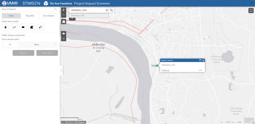
The search tool pans our map view to Vientiane at a larger scale, but users may notice that this specific point does not intersect with any infrastructure projects nor may it overlap with other layers. It may be best to draw a buffer around this point to analyze the region.
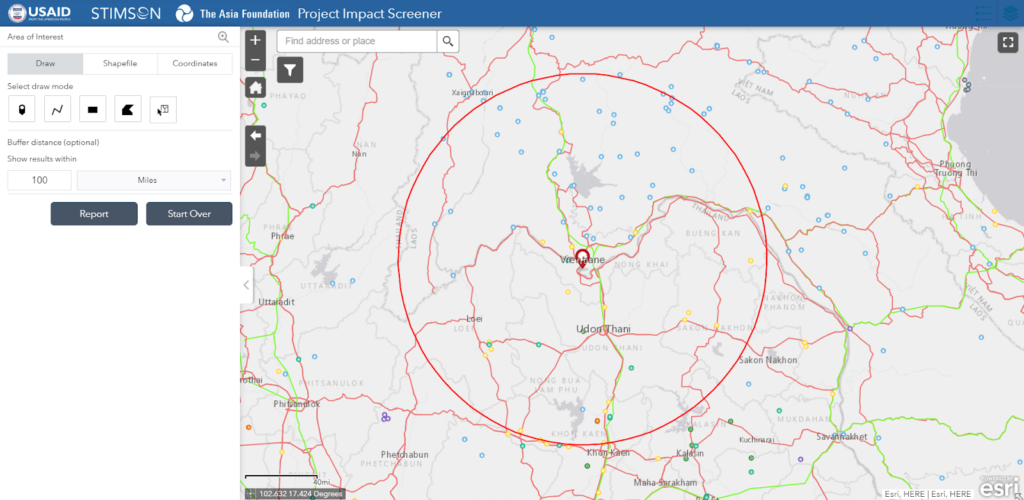
First, a marker is dropped onto the general location of Vientiane using the draw tool on point mode. Next, a 100-mile buffer is added around the central point, as reflected in the map above.
From this point, a report can be created by clicking “Report” or users may reset the screening tool by clicking “Start Over”.
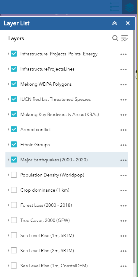
Next, we will need to turn on layers of interest for our analysis. In this example, all reportable layers are turned on.
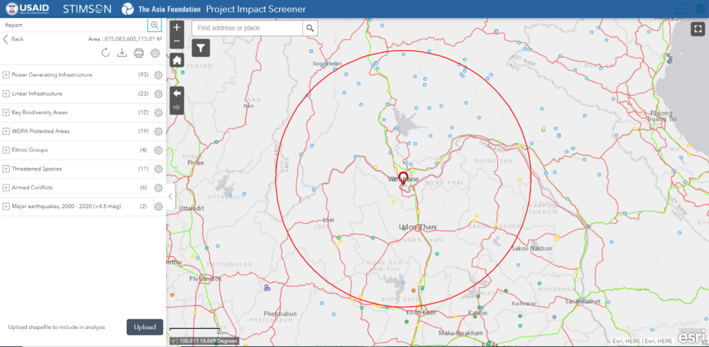
With the buffer in place and the layers toggled on, we click “Report” and wait for the tool to process the command. As the screening tool creates the report, users will notice each layer is screened individually and will not be altered until the process for all layers is finished. Once all the layers have been loaded, users may interact with the list as desired.
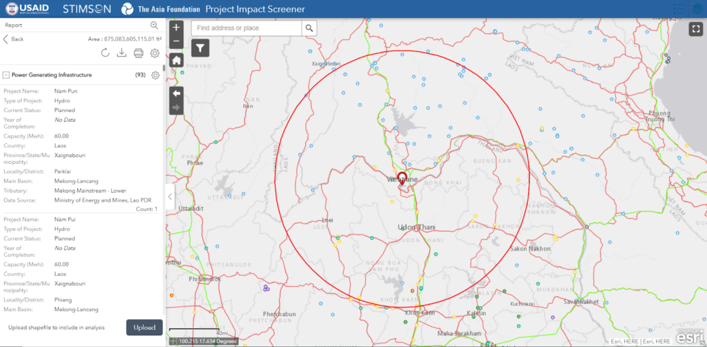
Information from the report will return in its collapsed form. Clicking on the “+” sign next to the layer name will open the detailed report with values from the layer’s attribute table. Information in this format can also be adjusted by clicking on the cog icon on the right side of the list.
At this point, the screening tool allows us to reset the search, download the screened layers, or print out the entire list of data points.

